
📊 Reports & Analytics Guide
Understand your spending patterns with visual reports and analytics. Make data-driven financial decisions.
Dashboard Overview
Your dashboard shows key figures for the current period at a glance:
💵 Card balance
Your actual money on this card right now.
📊 Current end balance
Projected balance at the end of the current period.
💰 Current saving
What this period has put aside so far.
💡 Unused budget
Budgeted money you have not spent yet.
Below them sit two charts - the percentage split of expenses by group, and a day-by-day summary of what left the card - plus the list of upcoming transactions.
The Report Page
The Report page goes further, across every period on the card. It is split into five tabs:
Overview
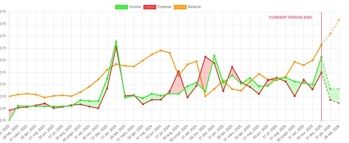
Total income, total expense, net cash flow and savings rate, with an income / expense / balance chart across your periods. Future periods continue as dashed lines past a "current period end" marker, so plan and history sit on one timeline. Narrow it to the last 6, 12 or 24 periods, or show all of them.
Groups & budgets
How each group has moved from period to period, so you can see which categories are creeping up. Groups can be toggled in and out of the chart.
Plan vs actual
Budgeted amounts against what was really spent - the honest answer to "did I stick to it?".
Expenses & events
Your largest transactions, and spending grouped by event so a trip or a wedding can be totalled on its own.
Card balances
How the balances of your virtual cards compare and move over time.
Using Reports to Improve
Action Steps:
- Identify problem areas: Which categories are over budget?
- Find patterns: When do you overspend?
- Set realistic goals: Adjust budgets based on reality
- Track progress: Are you improving month-to-month?
- Celebrate wins: Acknowledge when you stay on budget
Next Guide:
Advanced Features Guide